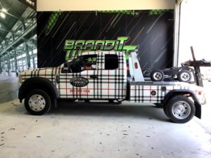
How you present your company on the road with your fleet of vehicles will make all the difference.
Today’s topic of discussion will be vehicle graphic design mistakes that can ruin your car wraps. Every company makes an excellent impression by having the appropriate marketing graphics, including your vehicle graphics. How you present your company on the road with your fleet of vehicles will make all the difference. Here are four valuable recommendations to avoid vehicle design mistakes that ruin car wraps.
Inappropriate Car Wraps for the Vehicle
Always consider the vehicle’s size, make, and model. For example, you’ll need a different vehicle wrap for a standard pickup truck versus a crew cab. Crew cabs are the largest cab sizes, seating up to five or six people with two full rows of seating. Short beds (8 feet long) also differ from extended beds (5 feet 8 inches long).
If the designer doesn’t have this in mind, the design could be too long, cutting off information. In addition, the wrap could be too short, not covering the vehicle entirely. You never want to have to redesign, repaint, or reinstall car wraps. Accurate specifications, measurements, and dependable vehicle templates matter.
Incorrect Information
Proof the layout to avoid mistakes. This suggestion might seem like common sense. However, people overlook this step. Not ensuring that the information you’re marketing is correct leads to delays and costly revisions. Every great design has a template. Vehicle graphics are no different.
Check the vehicle specifications and template used on your proof. Ensure that the graphics provider uses the correct vehicle template representing your car, truck, or van. Examine if the proof has the vehicle’s accurate year, make, model, and trim package. If you’re not using a full wrap, ensure that the vehicle’s color appears on the layout correctly. In addition, check for spelling errors and correct information such as the phone number, website, and proper spelling of the services offered.
Not Being Minimalistic
People have short attention spans. Many sources state that people become distracted or lose focus in eight seconds. You want to keep your marketing as minimalistic as possible for that reason. Don’t be too extreme with the copy, images, or design. The phrase “less is more” is true in this case. Therefore, we recommend avoiding complicated fonts and too much information, too many images, and jarring colors. You should also prioritize the overall message versus losing the message in an elaborate design.
Not Using Your Brand’s or Industy’s Colors
A design feature that captures attention is color. The color of your vehicle wrap should align with your brand. Restaurants usually have fun and energetic colors such as orange, red, or yellow. On the other hand, financial institutions might utilize a more professional color such as blue. Also, how you display colors on your website or marketing collateral should align with your vehicle wraps. Consistency is critical.
Are you ready for vehicle wraps to take your marketing efforts to the next level? Contact Brand It Wrap It today!
Contact Brand It, Wrap It for Wall Wraps and Commercial Graphics Today
If you are looking for a cool custom way to decorate your vehicle or advertise your business, make sure to check out Brand It, Wrap It, Custom Signs, and Vehicle Graphics. We are a full-service sign and wrap company that provides excellent quality signage for businesses both big and small throughout the Maryland, Virginia, and Washington, D.C. metro area. We provide customer service, use the best and latest sign printing technology, and pride ourselves on our attention to detail. To see how we can help your business shine, give us a call at 301-838-9727 or visit us online for an estimate. For more tips and articles like this, follow us on Facebook, Twitter, Pinterest, and Instagram.
