The effectiveness of your car wrap advertising will only be as good as your car wrap designs
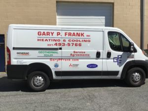
Car wraps are one of the most cost-effective and unique forms of advertising available today. They essentially function similarly to a billboard, except that they travel all over the area, being seen by more people in more places than a stationary billboard. Advertising through vehicle graphics is also more noticeable than a standard billboard. How often have you ignored a billboard but looked twice at an interesting paint job or finish on a car? The bottom line, however, is that the effectiveness of your car wrap advertising will only be as good as your car wrap designs. If it is not well-designed, it will fall flat. Let’s explore several things you should know before designing a car wrap.
Consistent Brand Identity
Choose a color scheme that is consistent with your logo and brand identity. You more than likely already have a design plan that was used in other marketing (including colors and fonts), and that should be where you start with your car wrap designs.
Clean And Contrast
This form of advertising gets a lot of impressions but doesn’t always allow for extended looks (if you’re driving, the time you have for someone to read your car could be very small). Because of this, clean and simple is the way to go. Your design should be pretty plain, with sharp contrast making the words and images easy to pick out.
Readability
While high contrast is important for the whole design, it is crucial for text. Choose a very legible, sans-serif font. Fancy fonts might look cool, but they likely won’t be read by anyone who sees them only for a brief moment. You should opt to make your font as big as you reasonably can as well. Your message should also be short – limit it to the most important words or phrases. Most people will not put in the effort to read a paragraph of text on your car.
Plan For 3D Space
Remember that your car wrap is a mobile advertisement that people will see from all sides. Plan to have you design on both sides of the car, the back, and the roof or hood. You want people to be able to see your ad from every direction, including the buildings above. An unused side is a missed impression. As your designer plans the wrap, they should also be planning for the potential distortion caused by the vehicle’s shape. This is especially relevant to text placement decisions since the curve of the surface can impact the readability of text.
Brand It Wrap It Is the Best Choice for Effective Fleet Wraps
If you are looking for a cool custom way to advertise your business with car wraps, make sure to check out Brand It, Wrap It, Custom Signs and Vehicle Graphics. We are a full-service sign and wrap company that provides excellent quality signage for businesses both big and small throughout the Maryland, Virginia, and Washington, D.C. metro area. We provide awesome customer service, use the best and latest sign printing technology, and pride ourselves on our attention to detail. To see how we can help your business shine, give us a call at 301-838-9727 or visit us online for an estimate. For more tips and articles like this, follow us on Facebook, Twitter, Pinterest, and Instagram.
